Next season's kit (1 Viewer)

thewards5579

New Member
But if you are even older (like me) then the City wore blue and white stripes and were nicknamed the Bantams
Were Coventry ladies called The Godiva Bantams and played in a green and brown striped strip

Sent from my Harrier Mini from EE using Tapatalk
 

oakey

Well-Known Member
Sky blue shorts and socks with any of these would be fine.
No white, navy or black shorts or we do not look like the sky blues to any objective viewer.
 

skyblueinBaku

Well-Known Member
I don't like the sky blue/dark blue halves. I just don't like any colours in that design. Quarters are even worse. I agree with Oakey about the shorts and socks. Sky blue shirts don't look right with dark shorts. Shorts should be sky blue or white if the shirts are sky blue.
 

Otis

Well-Known Member
Sky blue shorts and socks with any of these would be fine.
No white, navy or black shorts or we do not look like the sky blues to any objective viewer.
You don't like the ,70's kit then, which was exactly that, sky blue with dark shorts.

That was a great kit.
 

stupot07

Well-Known Member
kit%2B6.jpg

This would make wasps feel more at home.....


Sent from my iPhone using Tapatalk - so please excuse any spelling or grammar errors :)
 

Otis

Well-Known Member
Yep. It's bold and really stands out. With dark shorts and plain sky blue socks it would still look very sky blue.
 

tommydazzle

Well-Known Member
Have to agree with the Tesco basics comments for stripes - always hated that kit and disappointed that it will be forever associated with our Cup success. Plain sky blue for me and green/black away strip in the event of colour clash which should be pretty much never. I suppose it's a generation thing - I still can't abide sponsors on shirts or floodlights you can't climb up.
 

usskyblue

Well-Known Member
The Talbot 'T' kit and the shiny stripy Tallon one were amongst the worst.

I really liked the Skyblue tramline top of the late 70's/early 80's. Although the matching shorts took it a little over the top. Plain shorts would've been better. A more modern take on that kit would be interesting.
 

Gazolba

Well-Known Member
It's time we got rid of this 'Sky Blues' nickname that has us locked into a single colour kit. I suggest a new nickname "Tony's Tigers". Of course this will mean we can only hire managers whose name is Tony. Here is the suggested kit:

Tonys-Tigers.jpg
 

Gazolba

Well-Known Member
And another thing.....hate the shiny nylon look.

I quite liked the shiny blue shorts that the old Brazil team used to wear. It went really well with their yellow shirts.
 

skybluelee

Well-Known Member
Do we get a new home kit every year or two years on the Nike deal?

We've changed our home kit every single season since 1996 (barring the 13/14 - 14/15 one where they couldn't be arsed to put it on sale until halfway through the first season) so extremely unlikely that we will ever have a 2 year home kit again. Still, on the plus side at least we will get rid of those fucking stripes!

I think even this year's away kit is one season only despite many of our away kits having a 2 year life in the recent years.
 

Otis

Well-Known Member
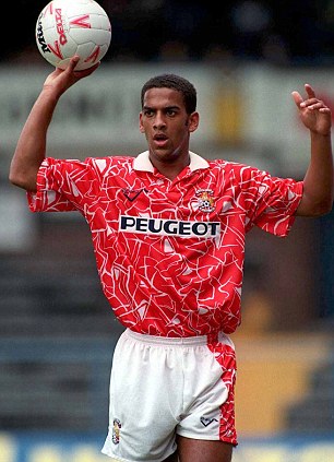
That list loses all credibility by its failure to include our away kit of 92/93, by far the worst kit ever worn by any club. Those shorts.

article-2175863-141FB35F000005DC-223_306x423.jpg
It is terrible, but there are worst kits in there I believe!

Dundee 1993 for one. Go have another look at that work of art!!
 

Otis

Well-Known Member
Hibernian 1977 and Kilmarnock 1992 kits are just plain awful too

Who on earth would mix purple and yellow?
 

Users who are viewing this thread

Top