You are using an out of date browser. It may not display this or other websites correctly.
You should upgrade or use an alternative browser.
You should upgrade or use an alternative browser.
New Kit (1 Viewer)
- Thread starter Saddlebrains
- Start date
Sick Boy
Super Moderator
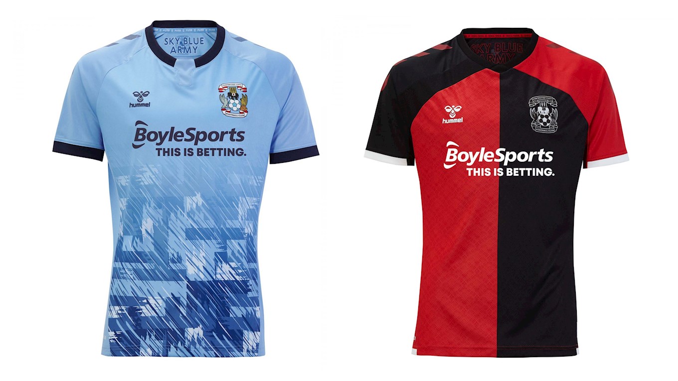
Haha yeah Godden looks a bit worse for wearWhen I saw the away kit this morning I thought it was hideous. Actually quite like it now.
As an aside, some of the marketing photos look dreadful.
")
Not a very photogenic personHaha yeah Godden looks a bit worse for wear
 .
.hill83
Well-Known Member
When I saw the away kit this morning I thought it was hideous. Actually quite like it now.
As an aside, some of the marketing photos look dreadful.
Godden is the bloke in this

Winny the Bish
Well-Known Member
They definitely didn't splash out on the promos. Marketing budget must be £0 because I agree that the photos are dreadful and were almost certainly done in-house. No way a professional photog came out with those pics.When I saw the away kit this morning I thought it was hideous. Actually quite like it now.
As an aside, some of the marketing photos look dreadful.
Marty
Well-Known Member
They definitely didn't splash out on the promos. Marketing budget must be £0 because I agree that the photos are dreadful and were almost certainly done in-house. No way a professional photog came out with those pics.
I agree that the photo's are terrible, you can see the shadows on the players faces.
I think the away shirt is terrible, It gets worse every time I look at it, not sure why they didn't just follow the natural stitch line of the sleeves to create the pattern. think it would have look loads better.
Tommo1993
Well-Known Member
I agree that the photo's are terrible, you can see the shadows on the players faces.
I think the away shirt is terrible, It gets worse every time I look at it, not sure why they didn't just follow the natural stitch line of the sleeves to create the pattern. think it would have look loads better.
Yeah but what do you really think about it?
larry_david
Well-Known Member
How come captain kelly hasn't been chosen for a photoshoot?
shmmeee
Well-Known Member
How come captain kelly hasn't been chosen for a photoshoot?
Because his replacement is about to arrive? Will be interesting who captains the team if that does happen.
Sky Blue Pete
Well-Known Member
Robins will have it covered I love the singers link it’s great
Mucca Mad Boys
Well-Known Member
Robins will have it covered I love the singers link it’s great
Seeing the link to our heritage was a nice touch. The kits are growing on me and the neutrals I have shown the home kit rate it.

D
Deleted member 7943
Guest
Now the refreshing is done with, got curious as to which old colour combos would work with the away kit. Would quite like a pink Singers coloured one somewhere down the line
View attachment 16645
I love that brown and white one lol fucking beautiful tbh
Last edited by a moderator:
D
Deleted member 7943
Guest
 saw this image on twitter had a few fans with high praise from other clubs... I have to say I really think this will be a cult classic, I think it's my favourite city top in my 36 years if I'm being totally honest
AOM
Well-Known Member
Now the refreshing is done with, got curious as to which old colour combos would work with the away kit. Would quite like a pink Singers coloured one somewhere down the line
View attachment 16645
That pink one
Winny the Bish
Well-Known Member
Looks like a Dulwich Hamlet kit and I would buy without even thinking.That pink one
SkyBlueGuy
Well-Known Member
Now the refreshing is done with, got curious as to which old colour combos would work with the away kit. Would quite like a pink Singers coloured one somewhere down the line
View attachment 16645
Weirdly I actually think the brown and white works really well here

kapowaz
Well-Known Member
Haha yeah Godden looks a bit worse for wear
The photo of Godden is atrocious because it commits one of the worst sins of photography: never photograph somebody outdoors in bright sunlight during the middle of the day. It casts terrible shadows on the face, which is why he looks so odd (particularly the way his nose casts a shadow on his face).
Johnnythespider
Well-Known Member
I think the sleeves are done that way because of the chevrons running down the shoulder in opposing colours, that wouldn't be possible if they followed a traditional sleeve line.I agree that the photo's are terrible, you can see the shadows on the players faces.
I think the away shirt is terrible, It gets worse every time I look at it, not sure why they didn't just follow the natural stitch line of the sleeves to create the pattern. think it would have look loads better.
Frostie
Well-Known Member
How come captain kelly hasn't been chosen for a photoshoot?
Not got the shorts in his size yet...

Sky_Blue_Dreamer
Well-Known Member
Now the refreshing is done with, got curious as to which old colour combos would work with the away kit. Would quite like a pink Singers coloured one somewhere down the line
View attachment 16645
Quite like all of them. Purple/yellow I think the purple needs to be darker as it looks more like blue and could be a Shrewsbury kit.
Fav is the city colours one. Really stands out.
AS86
Well-Known Member
Wouldn't mind a brown one if it was predominantly white with brown trim. Doesn't work for me as a half and half shirt anywayI love that brown and white one lol fucking beautiful tbh
AS86
Well-Known Member
Yeah think I just plucked the lighter shade from the 95 version. The gist of the city colours one would be nice but as above, the shades of green and red just give me a bit of a headacheQuite like all of them. Purple/yellow I think the purple needs to be darker as it looks more like blue and could be a Shrewsbury kit.
Fav is the city colours one. Really stands out.
Nick
Administrator
The photos had to be done outside I think.I agree that the photo's are terrible, you can see the shadows on the players faces.
I think the away shirt is terrible, It gets worse every time I look at it, not sure why they didn't just follow the natural stitch line of the sleeves to create the pattern. think it would have look loads better.
Liquid Gold
Well-Known Member
I wonder when we're going to start receiving them then. I noticed away shirt said end of September, probably the same for home.
Sick Boy
Super Moderator
Yeah, same for homeI wonder when we're going to start receiving them then. I noticed away shirt said end of September, probably the same for home.
OldBedrocker
Well-Known Member
Don’t know if this has been posted before but I’ve just been to the club shop and the guy said that they won’t be despatching the preordered shirts until the end of September. He also said there won’t be any in the shop for months due to Covid
Johnnythespider
Well-Known Member
My lads just won the home shirt on boylesports competition, he's made up.
Sky_Blue_Dreamer
Well-Known Member
My lads just won the home shirt on boylesports competition, he's made up.
So if you've made him up the story isn't true then.
Unless you mean he's put on some eyeliner and lippy to celebrate.
How much did he lose?My lads just won the home shirt on boylesports competition, he's made up.

Will he be the first fan to receive it, before the end of September?

Sky Blue Pete
Well-Known Member
NEWS: Coventry City shirt sales have increased 68% compared to last season!
Coventry City's shirt sales have increased by 68% compared to the same seven day period last season!
 www.ccfc.co.uk
Really great news
Johnnythespider
Well-Known Member
I've decided i now like the new shirt, seeing it in the flesh
kapowaz
Well-Known Member
My lads just won the home shirt on boylesports competition, he's made up.
see, this is how betting companies work: hook ‘em young!
Users who are viewing this thread
Total: 2 (members: 0, guests: 2)