pusbccfc
Highfield Road Hero
- Joined
- Apr 15, 2011
- Messages
- 20,418
- Reaction score
- 13,200



Follow along with the video below to see how to install our site as a web app on your home screen.
Note: This feature may not be available in some browsers.


It's out and it's white.





unless you're kit man in winterCan't go wrong with a white jersey


Because it's sky blue. Not difficult really.It's funny because when the home kit was released, people were raving on about how it was simple and clean.
Now people are skating this one
Kit is nothing special at all. Will end up in the easily forgotten list like the grey away from L2.
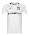
Because it's sky blue. Not difficult really.


Navy Shorts and White socks.
Reckon it will look good in full kit.
The Navy Shorts can now be worn, if we ever face a team with white shorts.

Kind of ironic to justify the pattern in terms of locales of the area and The Enemy and yet miss out Kenilworth.
Think it’ll look a bit weird given the white lines down the side of the home tbh.Think the home would look better with navy shorts imo

Well.... That is exactly what they are doing!Could you imagine if they actually try and pass this off as suburbs of Cov
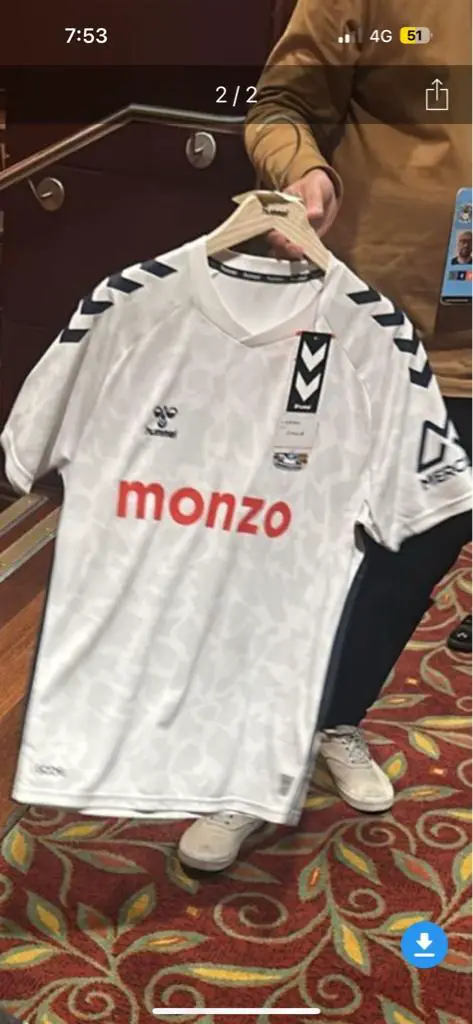
Sent from my iPhone using Tapatalk
)
I demand more Kenilworth representation.Yeah "Live and die in these towns" but not include any towns!
That kit always reminded me of a Mini CooperKit is nothing special at all. Will end up in the easily forgotten list like the grey away from L2.

F kenilworth.Kind of ironic to justify the pattern in terms of locales of the area and The Enemy and yet miss out Kenilworth.
Think it’ll look a bit weird given the white lines down the side of the home tbh.

Needs more beduffYeah "Live and die in these towns" but not include any towns!


Nowhere needs that, could probably do with lessNeeds more beduff
Needs more beduff

Kind of ironic to justify the pattern in terms of locales of the area and The Enemy and yet miss out Kenilworth.

...but not include any towns!