2023-24 New Kit Thread (5 Viewers)

Fergusons_Beard

Well-Known Member
487bb68ccc2f27befef242f9888c5bbc.jpg

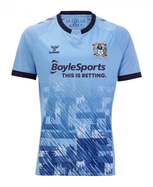
Zoom in and please tell me where the eagle, Phoenix and elephant are please?

All I can see is a design done by a toddler with a grey highlighter pen….


And don’t get me started on the different coloured shorts and socks (please god hope there last years!)

Sent from my iPhone using Tapatalk Pro
 

Ccfcisparks

Well-Known Member
487bb68ccc2f27befef242f9888c5bbc.jpg

Zoom in and please tell me where the eagle, Phoenix and elephant are please?

All I can see is a design done by a toddler with a grey highlighter pen….


And don’t get me started on the different coloured shorts and socks (please god hope there last years!)

Sent from my iPhone using Tapatalk Pro
Even if you can't see the eagle phoenix or elephant think the pattern still looks good.
 

SeaSeeEffCee

Well-Known Member
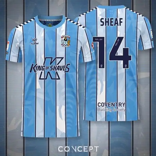
Honestly poorly designed striped shit.

You really can’t see the 3 mythical creatures in the background. (So what is the fucking point in having them there).

The neck line is crap, the stripes don’t carry on on the sleeves or the back (which it could and have a panel for the number).

For the first time in 45 years considering not buying a home kit.

Last time was the Shit all red away kit.

I really do hope they pay homage to the 140 years in the away or the 3rd.

Not just produce a fucking obvious brown kit.


Sent from my iPhone using Tapatalk Pro
Agree with most of this. It’s a bizarrely sloppy kit from Hummel when you look at the effort they’ve put in with us before and other teams too.
 

SeaSeeEffCee

Well-Known Member
It looks like they made the front of the shirt and then didn’t bother with the rest so just stitched on some left over sky blue sleeve and back (which aren’t the same shade of blue as the front) and called it a day. Might be my least favourite shirt since the Nike one which was mainly white.
 

Skybluedownunder

Well-Known Member
Now I’ve seen the shirt on I don’t know if I like it, the material doesn’t look stretchy muscle fit like this one was
14fddf042b5f26930349808512d2ecf2.jpg


Sent from my iPhone using Tapatalk
 

Ashdown

Well-Known Member
I see they didn’t even have the dreadful logo on the shirts .
Last years shirt and last years season was always going to be a hard act to follow.
I don’t get the love in with Hummel, apart from last years home shirt.
 

The Nomad

Well-Known Member
Most disappointing thing is that Hummel have provided some outstanding kits for almost every other team yet we get hit with this monstrosity.
 

Skybluedownunder

Well-Known Member
Honestly covcept and [mention]kapowaz [/mention] do much better kit creations than what we end up with. Always loved both of their stuff and then disappointed what we end up with


Sent from my iPhone using Tapatalk
 

AOM

Well-Known Member
487bb68ccc2f27befef242f9888c5bbc.jpg

Zoom in and please tell me where the eagle, Phoenix and elephant are please?

All I can see is a design done by a toddler with a grey highlighter pen….


And don’t get me started on the different coloured shorts and socks (please god hope there last years!)

Sent from my iPhone using Tapatalk Pro

I actually like it more in person, but I think we had the same issue with the shorts being a different shade of sky blue last season too.
From that photo, it looks like the shorts are the same shade as the arms, but these are different from the blue in the stripes. Weird
 

Users who are viewing this thread

Top