Fergusons_Beard
Well-Known Member
If you into this (and it DOES tell a story of our season so far) this set of graphs really quite an interesting read from https://experimental361.com/2019/02/04/scatter-graphics-league-1-4-feb-2019/
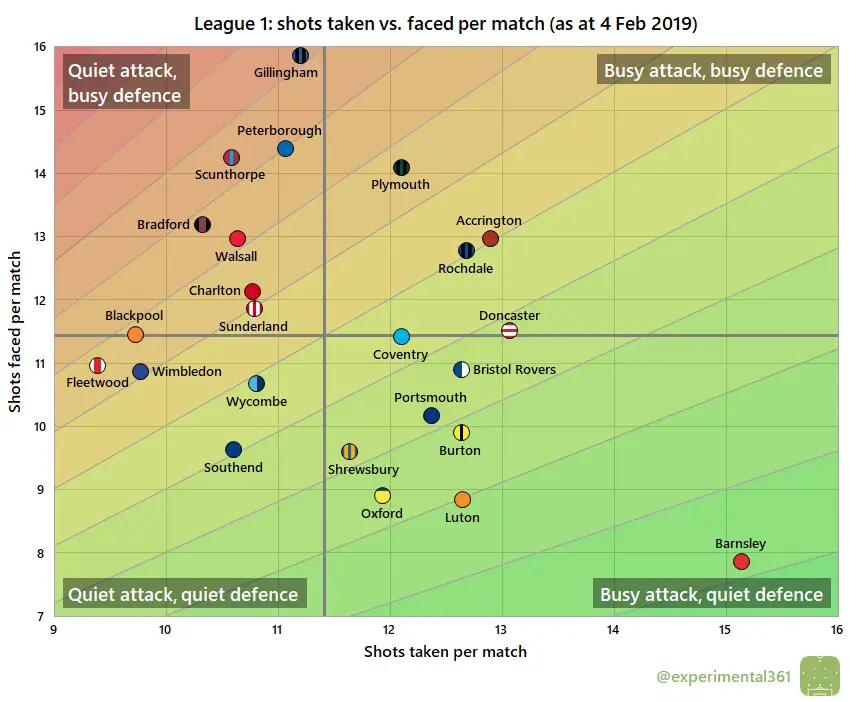
Shot dominance
First of all, here is how the number of shots taken by each club compares with those they face in return. The average number of shots taken per match is on the horizontal and the average number faced is on the vertical, so bottom right (take plenty, allow few in return) is good while top left (take few, allow plenty) is bad. The stripes are like contours: the greener the stripe, the better the performance (and vice versa for red).
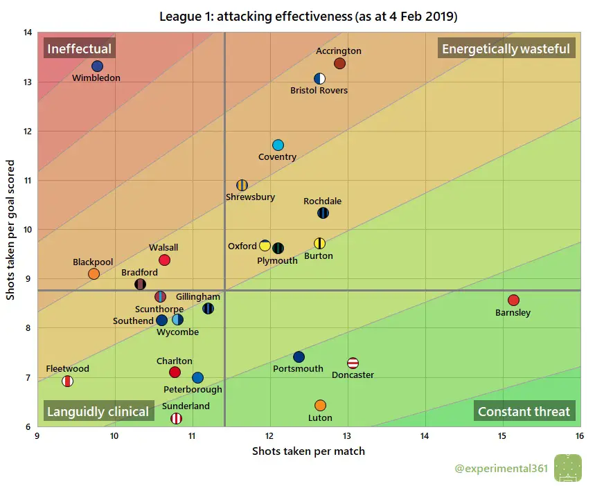
Attacking effectiveness
Now let’s look at attacking alone. The horizontal axis stays the same as in the graphic above, but now the vertical shows the average number of shots needed to score each league goal. Therefore bottom right is good (taking lots of shots and needing fewer efforts to convert) and top left is bad:
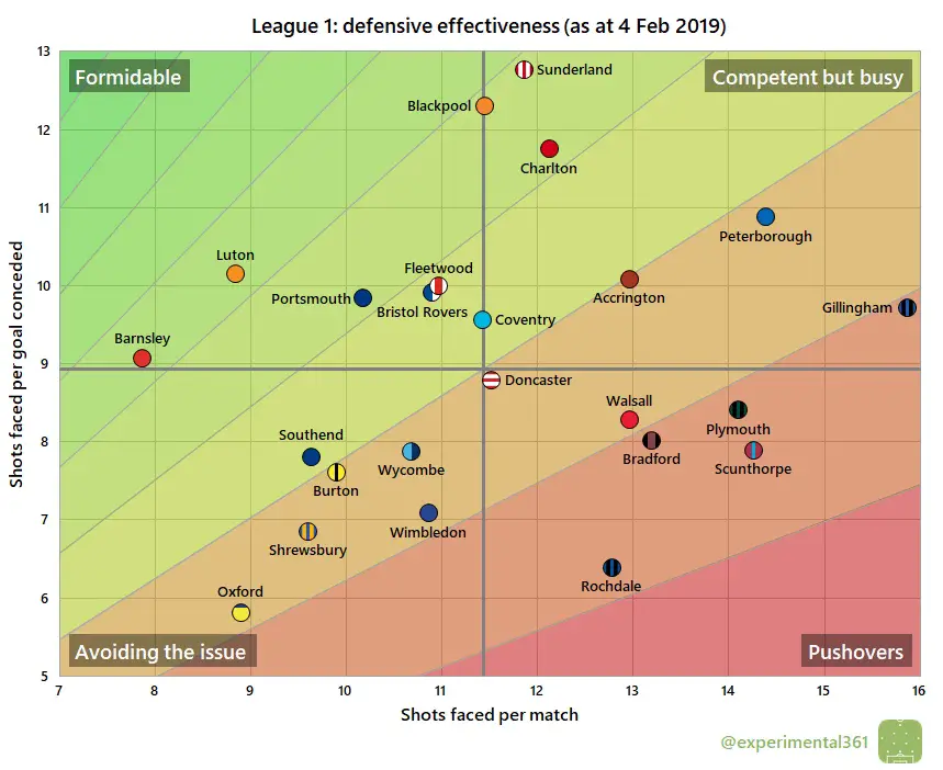
Defensive effectiveness
Next let’s look at the defensive situation – basically take the above chart and replace the word “taken” for “faced” on both axes. Now top left is good – facing fewer shots and able to soak up more per goal conceded – and bottom right is bad:
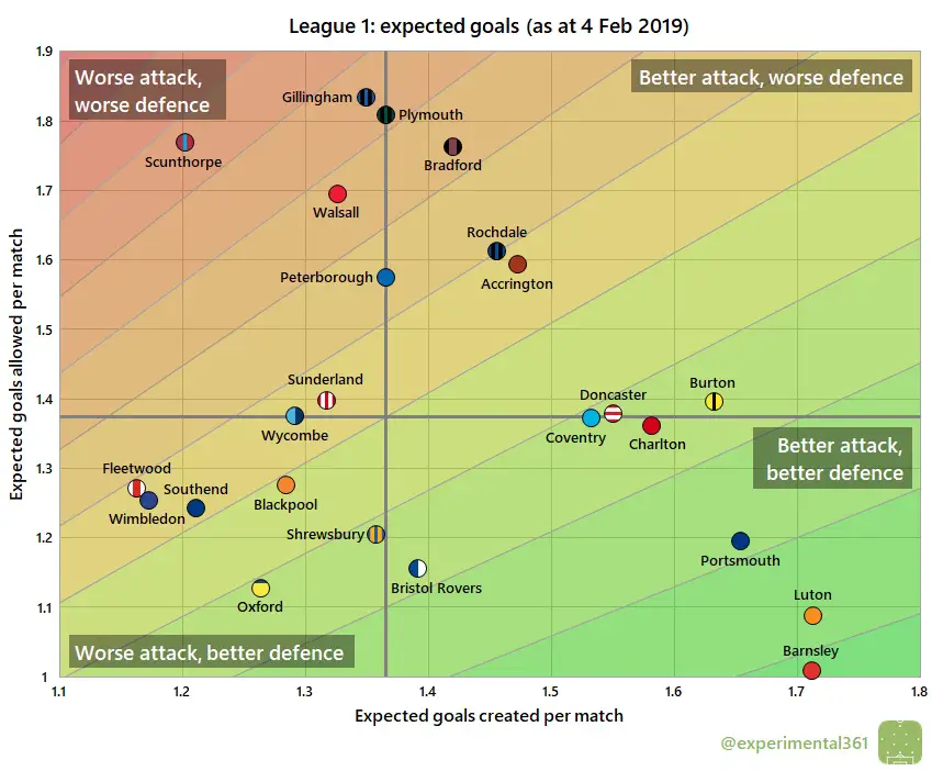
Expected goals
Finally here’s an attempt at correcting the first graphic for the quality of chances created and allowed, using the same “expected goals” values that power my shot timelines (explained here). The reason for doing this is that the results tend to correlate more strongly with performance than when we treat all shots equally:
Opinions?
Sent from my iPhone using Tapatalk Pro
Shot dominance
First of all, here is how the number of shots taken by each club compares with those they face in return. The average number of shots taken per match is on the horizontal and the average number faced is on the vertical, so bottom right (take plenty, allow few in return) is good while top left (take few, allow plenty) is bad. The stripes are like contours: the greener the stripe, the better the performance (and vice versa for red).
Attacking effectiveness
Now let’s look at attacking alone. The horizontal axis stays the same as in the graphic above, but now the vertical shows the average number of shots needed to score each league goal. Therefore bottom right is good (taking lots of shots and needing fewer efforts to convert) and top left is bad:
Defensive effectiveness
Next let’s look at the defensive situation – basically take the above chart and replace the word “taken” for “faced” on both axes. Now top left is good – facing fewer shots and able to soak up more per goal conceded – and bottom right is bad:
Expected goals
Finally here’s an attempt at correcting the first graphic for the quality of chances created and allowed, using the same “expected goals” values that power my shot timelines (explained here). The reason for doing this is that the results tend to correlate more strongly with performance than when we treat all shots equally:
Opinions?
Sent from my iPhone using Tapatalk Pro
 )
)
