kapowaz
Well-Known Member
I would love one!!! They look class!!
Thanks! I posted a link to the shop where I’ve put them on sale above!
I would love one!!! They look class!!
I think your quest for simplifying our badge is clouding your judgement.
Is selling those shirts not flirting a bit too close to copyright infringement?
Why do they still have McGinnty's mad badge still trademarked?Think you will find the term CCFC has been registered as a trademark too
Search for a trade mark - Intellectual Property Office
Think you will find the term CCFC has been registered as a trademark too
Search for a trade mark - Intellectual Property Office
Is selling those shirts not flirting a bit too close to copyright infringement?
Hate stripes.
I know one other like me who absolutely loves the Le coq ones of the Huckerby ,Whelan, Dublin era .Are you related to Torch?
Sent from my iPad using Tapatalk
I know one other like me who absolutely loves the Le coq ones of the Huckerby ,Whelan, Dublin era .
Can't wait to see it utilised at some future point.
Seems more a case of i want to sell a few shirts how best to advertise them
You love le coq? :cigar:I know one other like me who absolutely loves the Le coq ones of the Huckerby ,Whelan, Dublin era .
Can't wait to see it utilised at some future point.
They’ve got copyright on their original crest, but as you’ve all so emphatically pointed out, this doesn’t look like the original crest, so… ¯\_(ツ)_/¯
I actually like the swapping of our kit design - stripes/sky blue/stripes..... It's part of our (undeniable) history so is very relevant and in no way 'gimmicky'. I really have no preference.Hate stripes. The fading Tesco Basics bag stripes probably the worst kit ever. Shame we had stripes in 87 - looked like Sheffield Wednesday rather than the proud Sky Blues.
tradition of failure, I can do without that mate :angelic:By this logic we could/should get rid of the sky blue kit, the nickname, the song etc
Im not averse to some change but we need to be aware of the importance of tradition to many fans.
Sent from my iPhone using Tapatalk
Hey man I absolutely adore this, could post a png of the badge you used there please? And also, on the online store it has the original logo you posted here, but on the twitter post it has this simple version. Which one will be on the actual shirt you're selling?I agree! I actually made them a bit bigger in my latest mockup.
I can think of better ways.
Did you hire a graphic designerThanks, didn't take that long really.
Interesting post...
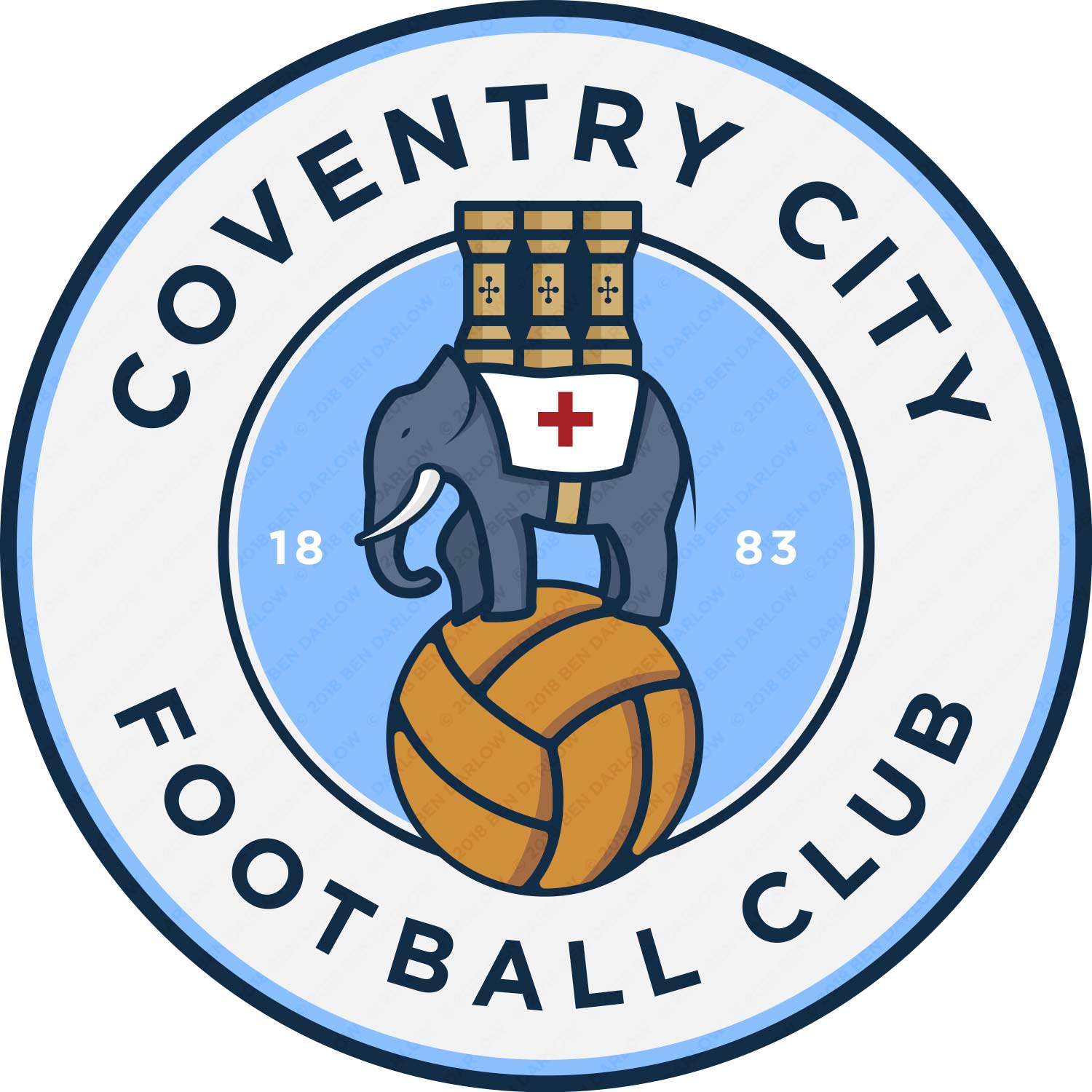
I run the agency that was behind the recent Manchester City badge redesign, and have been considering writing to the club for the past two years to propose / offer a redesign (or modernisation) of the club crest.
It doesn’t need to be changed significantly, but - as other posters have suggested - it would benefit from being redrawn. As a lifelong CCFC fan, I was going to extend our services FOC, but to do it properly would necessitate a significant fan consultation process. It doesn’t sound like there’s much of an appetite for it though, at least among those on this forum!
Hey man I absolutely adore this, could post a png of the badge you used there please? And also, on the online store it has the original logo you posted here, but on the twitter post it has this simple version. Which one will be on the actual shirt you're selling?
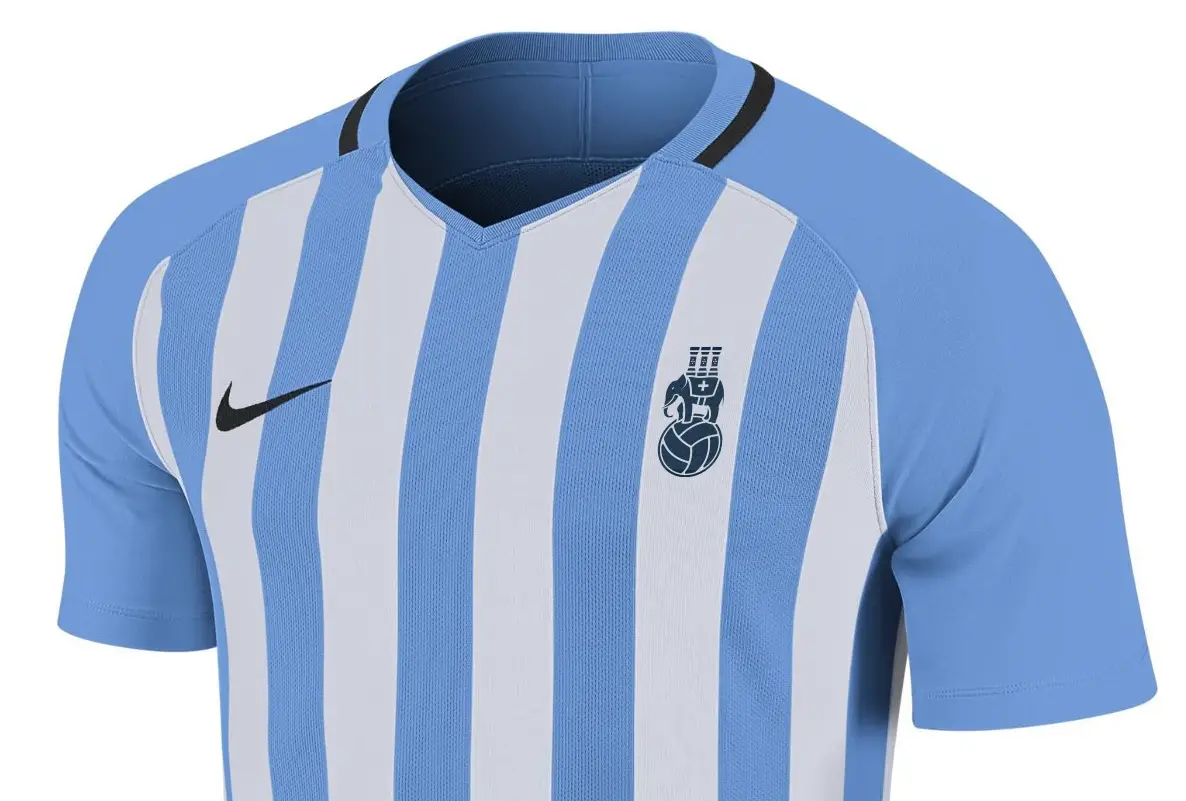
recommended by tiny tim by any chance?A couple of years ago I was preparing for my wedding, and lucky enough to be getting a tailored suit made. I had this crazy idea of the jacket lining be an authentic reproduction print of the 1987 FA Cup winning CCFC home kit, and I thought it’d be fun to have the club badge embroidered on the inside, maybe above the inside pocket. I’ve always been slightly dissatisfied with the club crest though, which I felt was overdue for a bit of a tidy up. Not a completely new take like the disastrous Mike McGinnity one from 2005, but an ‘evolution’ of the existing crest, with a more modern feel.
I decided to hire a graphic designer, and worked with him to create this new logo. It didn’t really work out though, and whilst what we came up with together (after many rounds of revisions and feedback) was clearly a cousin of the current logo, I wasn’t quite satisfied with the outcome, so I shelved the idea, and forgot all about the illustration files he’d come up with.
A year or so later I decided to have another play at creating something out of the previous design, and finally came up with something I liked. I’ve been sitting on the design for a while, uncertain exactly what to do with it. I thought maybe it was good enough to share with the club? But maybe that’s crazy talk. What would other actual fans think of it?
A few months back I saw a preview of Nike’s Teamwear range for 2018/19, which includes a sky blue and white striped shirt that I can easily see us using as our kit next season, so I stuck the badge on it. I ended up tweeting this mockup on Friday night as part of a conversation about our Puma shirt history, and then popped the new badge on Twitter itself for good measure.
So I thought, why not share it with a bunch of Sky Blues fans, and get some feedback?
Anyway, let me know what you think?
recommended by tiny tim by any chance?
A couple of years ago I was preparing for my wedding, and lucky enough to be getting a tailored suit made. I had this crazy idea of the jacket lining be an authentic reproduction print of the 1987 FA Cup winning CCFC home kit, and I thought it’d be fun to have the club badge embroidered on the inside, maybe above the inside pocket. I’ve always been slightly dissatisfied with the club crest though, which I felt was overdue for a bit of a tidy up. Not a completely new take like the disastrous Mike McGinnity one from 2005, but an ‘evolution’ of the existing crest, with a more modern feel.
I decided to hire a graphic designer, and worked with him to create this new logo. It didn’t really work out though, and whilst what we came up with together (after many rounds of revisions and feedback) was clearly a cousin of the current logo, I wasn’t quite satisfied with the outcome, so I shelved the idea, and forgot all about the illustration files he’d come up with.
A year or so later I decided to have another play at creating something out of the previous design, and finally came up with something I liked. I’ve been sitting on the design for a while, uncertain exactly what to do with it. I thought maybe it was good enough to share with the club? But maybe that’s crazy talk. What would other actual fans think of it?
A few months back I saw a preview of Nike’s Teamwear range for 2018/19, which includes a sky blue and white striped shirt that I can easily see us using as our kit next season, so I stuck the badge on it. I ended up tweeting this mockup on Friday night as part of a conversation about our Puma shirt history, and then popped the new badge on Twitter itself for good measure.
So I thought, why not share it with a bunch of Sky Blues fans, and get some feedback?
Anyway, let me know what you think?
Why do we need a new badge? Especially a sub standard one.
We don’t need one. This was just for fun. But cheers for pissing on my cornflakes mate.
So you asked for feedback when really you only wanted positive feedback?
")