A new CCFC club badge (1 Viewer)

D_Boult

Active Member
Hah!
That’s a big part of why I thought just make something myself and then if other fans like it, push it in front of the nose of the club. Football club management often seem incapable of running their primary going concern, let alone having the right skills (and good taste) to do stuff like this right. Whenever clubs do manage it you have to wonder how!

You should share some stories about clubs (names redacted to spare the guilty!) you’ve worked with, I’d love to hear those! :cigar:

Ha! It's a small world and some of the clients I still work with... my lips are sealed I'm afraid.

To be fair to clubs I have the same problems with most clients! They pay you and then wonder why you have an opinion on the work! It's a sales job as much as anything else. Anyway, I must away. Again, hats off to you. If I ever get the gumption / time I'll report back!
 

Skyblueweeman

Well-Known Member
I think it's about time we drew up a list of what us Cov fans could be considered experts at:

* Bad jokes
* Arguing
* Apathy
* Strong gif games
* Legal processes
* Hedge Fund knowledge
* Club finances
* Graphic design
* Fondness for ex-players/managers
* Pompey
* '5 things you didn't know about....'

Anything else?
 

Hadji's_Goatee

Well-Known Member
I agree with the comments that it is far too similar to the Man City badge. It's bad enough that ignorant journalists also call them the sky blues - this would only add to the confusion
 

Captain Dart

Well-Known Member
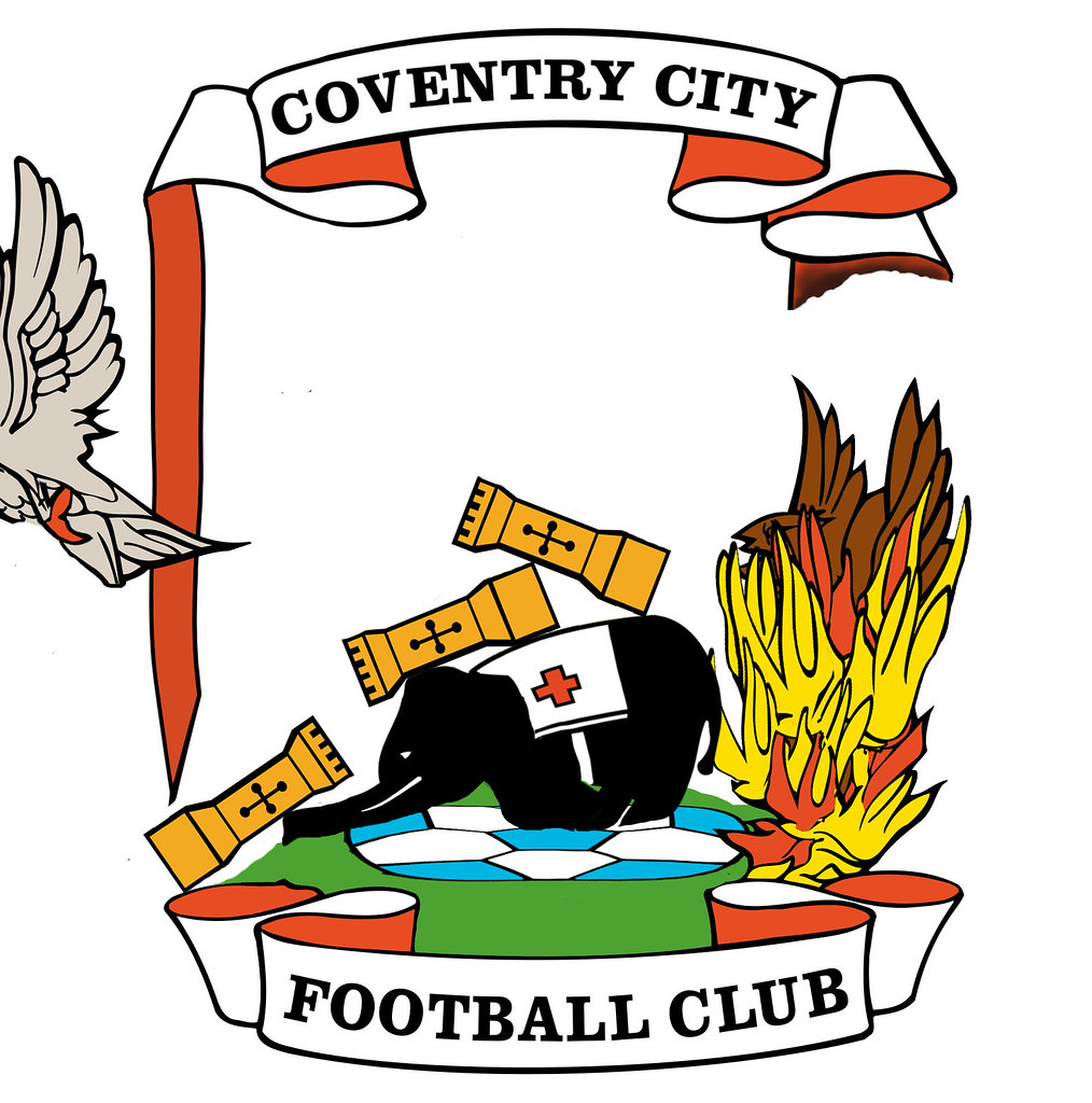
I don't understand the love for the current badge, its cluttered and over complex, too many colours.

Which wag did this one?
9450719067_cfb2971ffb_b.jpg
 

Hadji's_Goatee

Well-Known Member
I don't understand the love for the current badge, its cluttered and over complex, too many colours.
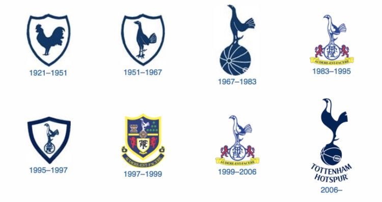
I would prefer to strip it back to the good old days - just the ball, elephant and castle. That would be a class design approach. I hate to admit it but Spurs did a slick job in 2006 when they did a re-brand job - I think it is the best example to date of a club moving forward by looking back
b6d168474cf34e85e4ec68cab8216bd7.jpg
 

kapowaz

Well-Known Member
I don't understand the love for the current badge, its cluttered and over complex, too many colours.

100%. Both the Eagle and Phoenix look rubbish. The football looks like one of the crap souvenir balls from the old club shop that would turn into an egg as soon as you kicked it. And as you say, way too many colours.
 

kapowaz

Well-Known Member
I would prefer to strip it back to the good old days - just the ball, elephant and castle.

That’s kind of what I was going for, although then you have to consider whether or not any text will accompany it, or if it would be used image-only. I’d like to have another go at creating a simpler variant of the three elements from the design I shared, but I suspect a lot of people won’t like that it doesn’t mention the name of the club. Unfortunately you can never please everyone with these things.
 

rondog1973

Well-Known Member
Love our current badge, indeed, have it tattooed on my arm. But I do think it's a little too grandiose for the club strip.

Would love a more simplified version on the kit. The 60's Ball-Elephant-Castle design would be perfect. Spurs have gone back to a bygone design in recent years and I think their Jersey looks a lot more stylish as a consequence.
 

rondog1973

Well-Known Member
I would prefer to strip it back to the good old days - just the ball, elephant and castle. That would be a class design approach. I hate to admit it but Spurs did a slick job in 2006 when they did a re-brand job - I think it is the best example to date of a club moving forward by looking back
b6d168474cf34e85e4ec68cab8216bd7.jpg
Ha ha! Was typing whilst you posted!
 

kapowaz

Well-Known Member
I’m going to have to have a go at something along these lines then report back :)

I have to wonder if this isn’t why the green and black away version is my favourite of the two versions I made...
 

Hadji's_Goatee

Well-Known Member
100%. Both the Eagle and Phoenix look rubbish. The football looks like one of the crap souvenir balls from the old club shop that would turn into an egg as soon as you kicked it. And as you say, way too many colours.
The Black Eagle has very very weak links to the city and club, and I'm also not keen the on the Phoenix from the flames. The only reason we retained the bloody thing after the centenary re-design in 1983 was because it plays on the WWII emotions. But take the emotion away and logically it is also nonsense. Lets get back to the roots and put the mythical creatures in the bin.
 

Hadji's_Goatee

Well-Known Member
Yeah, I was reading this article earlier too, which talks about Leofric’s eagle and the phoenix only being added in 1959, which is so long after the club’s inception as to make them unnecessary in my view.
The weirdest thing is that the Monarch who was Leofric was said to of been put to death by red hot poker up his jaxxy - ouch! Again what that has to do with CCFC i'll never know. Probably there for aesthetics to balance out the bird on fire.
 

Hadji's_Goatee

Well-Known Member
Maybe we should add an angry cat on the top though?
I think the cat like the phoenix is more of a civic thing rather than club. I'm a fan of the elephant because it represents footballing attributes, strength, fight, spirit. And the castle the fortress of our home ground.
 

lifeskyblue

Well-Known Member
Yeah, I was reading this article earlier too, which talks about Leofric’s eagle and the phoenix only being added in 1959, which is so long after the club’s inception as to make them unnecessary in my view.

By this logic we could/should get rid of the sky blue kit, the nickname, the song etc
Im not averse to some change but we need to be aware of the importance of tradition to many fans.


Sent from my iPhone using Tapatalk
 

Liquid Gold

Well-Known Member
I like our badge, think it stands out as one of the best. Nothing worse than these horrible crest designs with nothing going on. If we were to change it then I would say go back to just the elephant and ball.
 

kapowaz

Well-Known Member
By this logic we could/should get rid of the sky blue kit, the nickname, the song etc

I dunno, I think some of these are clearly part of our club’s identity, but others aren’t so much. The eagle and phoenix were absent from previous club logos and the Sky didn’t fall then. Given they weren’t even added to the city’s heraldic emblem until 1959, they’ve probably been absent more than present!
 

itsabuzzard

Well-Known Member
Ha, I know what you mean! Unfortunately taking liberties is a little bit necessary to give the pose any kind of interest. Just look at the poor elephant on the current logo. It’s not easy to tell if those are skinny legs behind, or if it’s meant to be an outline for contrast (I assume the latter but it still looks kind of weird).

You’re the second person to mention badges though. I had already thought I might look into that; it’s kind of expensive unless you have a decent order size though. Would anyone else be interested if I did make a limited run of them?
Me

Sent from my LG-H850 using Tapatalk
 

skylark37

Well-Known Member
I still in general really like our badge and although some might argue that it looks dated / over cluttered I think given all the uncertainty surrounding the club in recent years, identity is really important so I can't see a badge change for a little while yet.

The 2011 badge change was a good simplification in my opinion. Perhaps similar to what spurs have done. If this was based on our crest from an earlier era does anybody know which it was?
http://news.bbcimg.co.uk/media/images/52122000/jpg/_52122192_city_kit_badge_226.jpg

Only other thing I wondered was whether Lady Godiva could be included on a badge design somehow? That would surely be unique. I could actually see that working with your cartoon style, kapowaz. I think those you've posted here were nicely designed on the whole but too similar to Man City.
 

Liquid Gold

Well-Known Member
Stay away from the Godiva theme, don't want to look anything like Cov Utd. Man City fans actually requested a change back to a circular design as that's what they've historically had. I don't think we've ever had a crest around our badge for any significant period of time so should be avoided. Anything that makes us look more like Man City should be avoided.
 

Captain Dart

Well-Known Member
Stay away from the Godiva theme, don't want to look anything like Cov Utd. Man City fans actually requested a change back to a circular design as that's what they've historically had. I don't think we've ever had a crest around our badge for any significant period of time so should be avoided. Anything that makes us look more like Man City should be avoided.
Apart from winning all the time. :emoji_grin:
 

Alkhen

Well-Known Member
Sorry man I dont like those at all.

I think the current one works really well and unless they were to go for a elephant on a football silhouette then id leave a badge change well alone.

I honestly think we have one of the classiest badges around. Far better than most revamps over the last few years.
 

Users who are viewing this thread

Top