new kit details (2 Viewers)

italiahorse

Well-Known Member
I just get home/away for my son. I don't buy them for myself.

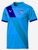
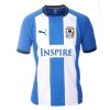
Cheap tat compared to previous shirts. Really? SISU don't manufacturer them themselves you know.

Anyway this WAS a thread about football shirts, but I don't suppose you could resist.

.... and that's why I gave my reasoning for not buying one, followed by a similar reasoning for purchases of F&B, in the interest of fairness ;)
Under the old Ricoh deal I never bought anything at the Ricoh but I buy now because it makes a 'contribution' to CCFC income.

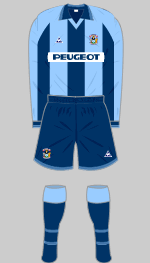
I can say that I was bought a signed Away shirt for Xmas with the double whammy of not only being Tat, but it has a majority of players on it that are no longer here.
 

Joy Division

Well-Known Member
Although we have the Puma logo on the shirts we've been supplied by 3rd party company Genesis sports for about 10 years now. Nearly always having an 'off the peg' template design (there have been a couple of seasons where we have had exclusive designs)

I'd imagine we probably wont have an exclusive design next season so potentially something from the new Puma template catalogue for 2015/16 below

http://www.footyheadlines.com/2015/01/puma-15-16-teamwear-kits.html
 

Nick

Administrator
One on the left, sky blue for the red with dark blue for the black :)

Puma-15-16-Teamwear-Kits-Overview.jpg
 

CovisGod

Well-Known Member
Yeah this seasons away is incredibly see through, I've got a big tattoo on my chest that's black ink, you can clearly see it :-/ I'd love to see that purple 3rd kit from the 90s make a comeback ;) anybody got a pic ?
 

Nick

Administrator
It isn't the sizing that does me, it is the smell! Hot summers day, few beers, somebody has a footy top on. Absolutely stinking!
 

torchomatic

Well-Known Member

rondog1973

Well-Known Member
I want that jazzy effort in the middle, it reminds me of the old Dutch kit from Euro 88.
Yeah, the Soviet Union had the same design in red.

With regard to the overall kit, I favour plain(ish) sky blue jerseys, very dark blue shorts and sky blue socks. All sky blue or with white shorts looks too alike Man City and stripes looks like Huddersfield to me. Sky blue tops/dark blue shorts is unmistakably 'us'.
 

oakey

Well-Known Member
Man City always had white shorts so our kit didn't resemble theirs until they decided to copy our shorts colour.
 

rondog1973

Well-Known Member
Man City always had white shorts so our kit didn't resemble theirs until they decided to copy our shorts colour.
Ah, but we apparently wear sky blue (It was reintroduced by Derek Richardson in the 60's) in homage to Man City.
 

B-Ban-Boogie

Well-Known Member
I'm always pissing about on Photoshop and came up with this one a few months ago.. :D

attachment.php


Took it from an old Wigan Kit..
 

Attachments

  • ccfc2015.jpg
    ccfc2015.jpg
    94.3 KB · Views: 120

CJ_covblaze

Well-Known Member
I'm always pissing about on Photoshop and came up with this one a few months ago.. :D

attachment.php


Took it from an old Wigan Kit..

Similar to the 125 year shirt. Last one I bought was the 50 years of Sky Blue.
 

Irish Sky Blue

Well-Known Member
The kit I will always dislike is the home kit for the last two seasons as it will forever be in my mind the "Northampton kit." My favourite kit was the tramlines kit maybe because of the players we had wearing it.
 

Gazolba

Well-Known Member
Please make it symmetrical. Anything asymmetrical offends my sense of proportion. I favour a single, central wide blue stripe with white edges. Kind of like the Ajax strip except with blue instead of red. Could have a sky blue collar and narrow sky blue stripe separating the blue from the white. Wish I could draw it but all I have is Windows Paint.
 
Last edited:

Users who are viewing this thread

Top