AOM
Well-Known Member
If that is a Hummel detail and not just a coincidence, then I think it rules out our adopting it as the club badge.
Yeah seems to only be used in relation to kits, so I'm guessing it is Hummel specific
If that is a Hummel detail and not just a coincidence, then I think it rules out our adopting it as the club badge.
The middle one looks like a cock and bollocks just after leaving the bathThe top one looks like it's on acid.
Or Asian? Just going by the ear size of course.American Investment incoming..👁👁
Looks like third reich or Revie youth symbolism.Looks like a paint shop
Sent from my iPhone using Tapatalk
...you definitely need to put more cold water in, mate.The middle one looks like a cock and bollocks just after leaving the bath
That’s exactly what they want you to think at this point.Yeah seems to only be used in relation to kits, so I'm guessing it is Hummel specific
Thinking on it, if the club want a secondary logo. We could look at the late 90s interwind letters.
Could look good on the back of the kit?
View attachment 44494
Yours has tusks?The middle one looks like a cock and bollocks just after leaving the bath
Explains a lotYours has tusks?
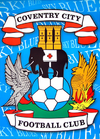
I genuinely think the CCFC crest is one of the best in English football, lots of history and nods to the city in it.I've long thought our club crest is over fussy and unnecessarily 'pimped'.
Once the bantam was dispensed with nothing could better the simple elephant standing on a ball motif.
Said it before, don't mind repeating it - Sometimes less really is 'more'.
I can't think of two better examples of clubs minimising club crests in a classier way than Forest and Wolves.
King out. The black top from last season has a different crest. IIRC it doesn't even mention our clubs name anywhere. How are people supposed to take the piss if they don't know which club i support.This will be the next Doug does a u-turn.
Changes logo…..fans complain…..changes it a few days later back to how it was. Doug apologies that he got it wrong. We all hail Doug for listening.
King out. The black top from last season has a different crest. IIRC it doesn't even mention our clubs name anywhere. How are people supposed to take the piss if they don't know which club i support.
More like batman on a motorbikeThe top one looks like it's on acid.

Think a lot of the new ones are shiteI've long thought our club crest is over fussy and unnecessarily 'pimped'.
Once the bantam was dispensed with nothing could better the simple elephant standing on a ball motif.
Said it before, don't mind repeating it - Sometimes less really is 'more'.
I can't think of two better examples of clubs minimising club crests in a classier way than Forest and Wolves.
Really intrigued to see what that would look like!The badge just needs a redraw (not a redesign). Some of the elements are pretty crude. Probably get hammered for that, but only an opinion... And I design logos for a living, for what thats worth.
Well, it's a ton of time to do, so its something I wouldn't even attempt 'in my spare time' as I'm probably onto a hiding to nothing!Really intrigued to see what that would look like!
Curiously what elements do you think would need a redraw from your perspectiveWell, it's a ton of time to do, so its something I wouldn't even attempt 'in my spare time' as I'm probably onto a hiding to nothing!
It all points to it being our new badge after this season, IMO.
Well, most of it! Quick list:Curiously what elements do you think would need a redraw from your perspective
Anybody over the age of 15 talking about "tifo" should have their hard drive checked.Tbf it pissed all over our tifo.
See now I’d want to see your redraw/redesign. Can’t disagree especially on point 5Well, most of it! Quick list:
1. Typeface is spaced badly, doesn't align with the banner
2. Certain parts of the elephant are 'weak' and don't reproduce well - it's also drawn in a different style to the other two 'animals'
3. The leg on the eagle is awful, looks like an add on - as does the tail. Scale of the bird is generally pretty all over the place
4. Pheonix is again a bit clumsy, scale, feathers are incorrect
5. Gradients are naff, buts thats a very subjective thing!
All heresy I know. But there you go. The more you look, the more there is.
Oh and BTW I love it as an overall crest, its one of the best, but it could be so much better... two penneth.
Well, I'd love to do it BUT the time involved and the fact I get paid to do it day in, day out means that it probably won't happen. I did contact the club years ago and offered my services to give it a try and see if they liked it, but silence.... Which I get. You never know I might try again if I have any time, but again, I wouldn't even know who to contact there, and I know how these things tend to work!See now I’d want to see your redraw/redesign. Can’t disagree especially on point 5
Anybody over the age of 15 talking about "tifo" should have their hard drive checked.
This is the main way badges should be updated for me, unless the original is just shit of course. But a redraw/clean up, Norwich was a good example. Newcastle should do the same too, there's is pretty bad. Great badge that just needs a refresh, the lion is awfulWell, most of it! Quick list:
1. Typeface is spaced badly, doesn't align with the banner
2. Certain parts of the elephant are 'weak' and don't reproduce well - it's also drawn in a different style to the other two 'animals'
3. The leg on the eagle is awful, looks like an add on - as does the tail. Scale of the bird is generally pretty all over the place
4. Pheonix is again a bit clumsy, scale, feathers are incorrect
5. Gradients are naff, buts thats a very subjective thing!
All heresy I know. But there you go. The more you look, the more there is.
Oh and BTW I love it as a overall crest, its one of the best, but it could be so much better... two penneth.


Completely get that. Did you draw one previously that you sent to the club for a proof of concept?Well, I'd love to do it BUT the time involved and the fact I get paid to do it day in, day out means that it probably won't happen. I did contact the club years ago and offered my services to give it a try and see if they liked it, but silence.... Which I get. You never know I might try again if I have any time, but again, I wouldn't even know who to contact there, and I know how these things tend to work!
Both.The term or the product itself? Wouldn’t mind seeing the end of either.
They redid it in the 80s didn't they and we ended up going back to the old one.Well, most of it! Quick list:
1. Typeface is spaced badly, doesn't align with the banner
2. Certain parts of the elephant are 'weak' and don't reproduce well - it's also drawn in a different style to the other two 'animals'
3. The leg on the eagle is awful, looks like an add on - as does the tail. Scale of the bird is generally pretty all over the place
4. Pheonix is again a bit clumsy, scale, feathers are incorrect
5. Gradients are naff, buts thats a very subjective thing!
All heresy I know. But there you go. The more you look, the more there is.
Oh and BTW I love it as a overall crest, its one of the best, but it could be so much better... two penneth.
Its much cleaner now than it was. Leave it be now I say.They redid it in the 80s didn't they and we ended up going back to the old one.