Alkhen
Well-Known Member
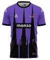
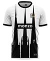
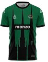
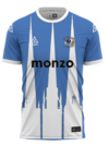
Not against a switch up but please no Adidas or Nike! They give zero shits about smaller clubs. We'll be farmed out to some 3rd party supplier and back in off the peg team wear like we were under Nike before. Dark days.I love the designs we get from Hummel, but the quaity is very hit and miss.
I think this is the last year of the existing Hummel Deal, would love us to get Adidas next. Imagine the new CBO will have instructions to get us the best kit deal, hopefully a bespoke deal rather than standard teamwear issue
The mid tier brands like Umbro, Hummel and Macron are far superior when it comes to bespoke designs actually understanding a clubs history.

