Club25
Member
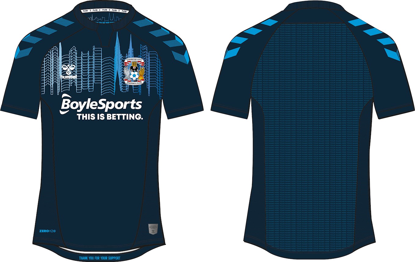
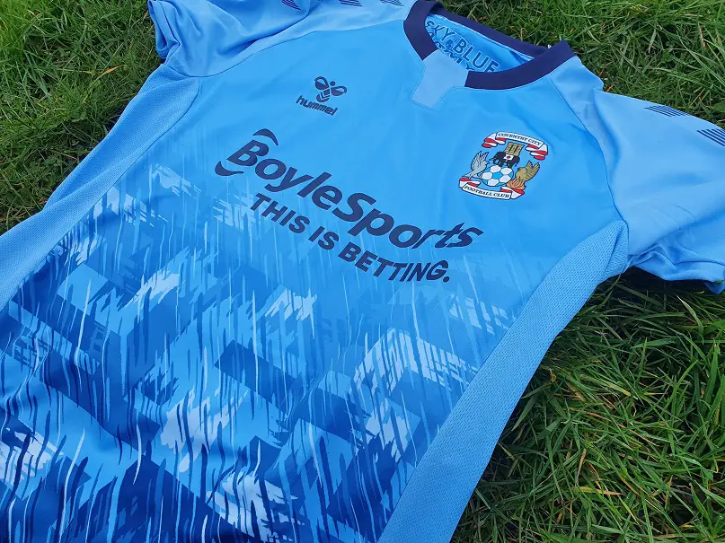
Hi all, pardon the intrusion. I'm a football shirt collector with a preference for novel and interesting kits, and every other week I pen a needlessly long article/review about a shirt I've managed to add to the collection. If the title wasn't a dead giveaway already, I'm sure you can guess it now; I've bought Coventry's current home strip, pleased as I am that the sky blue is now finally being given the attention it deserves by a proper brand, rather than by the disinterested Nike (and Puma before them).
If you fancy a read or want a closer look at the shirt before buying one yourself, do please have a look!;
Club 25 Football
I've blown through 4000 words giving my own perspective, but I'm really curious to learn what actual fans of the club think about this shirt. Happy with the return of the old 90's pattern or is it a bit too much? Displeased with a betting sponsor or apathetic when you're already playing in the SkyBet Football League? And is hummel a step up from Nike, or was I alone in my frustration that they kept dishing out standard off-the-peg shirts that you'd also see on Sunday League teams?
And do let me know if I've made any mistakes in the article; I'm only a neutral football fan, so I don't know Coventry City through and through.