Hummell (1 Viewer)

lifeskyblue

Well-Known Member
I think the Man Utd pastel pink kit is awful. Looks insipid when they play in it....doesn’t know whether to be white or pink under floodlights. If you go pink go for a strong pink.


Sent from my iPhone using Tapatalk
 

kapowaz

Well-Known Member
I think the Man Utd pastel pink kit is awful. Looks insipid when they play in it....doesn’t know whether to be white or pink under floodlights. If you go pink go for a strong pink.

The value in these kinds of kit is in the fashion statement amongst fans, not really how good (or bad) they look on the pitch. Given how much of a money spinner football kits are today I’d be much happier with us choosing a kit that looks class to wear (even if only subjectively) and so a load of fans buy them. More money in the bank.

Obviously, best of both worlds would be even better!
 

lifeskyblue

Well-Known Member
You are probably right and I am admittedly getting on and not fashion conscious in the slightest. But I would be one fan who wouldn’t buy if it became our second kit


Sent from my iPhone using Tapatalk
 

kapowaz

Well-Known Member
If we were still with Nike next year I'd have been happy with these:


Both very nice, although with the exception of the half-half toning the home shirt is basically Man City’s 18/19 shirt, right? One thing I am looking forward to is having some uniqueness to our kit from next season instead of a hand-me-down.
 

kapowaz

Well-Known Member
Oh, and ConceptKits deserve credit for making the Midrepro logo monochrome: it’s way better that way.
 

kapowaz

Well-Known Member
Ha, those are amazing! I think if the purple and yellow one was actually halved different shades of purple vs different shades of yellow then that could work really well.
 

Neil

Member
I've heard the kit is going to be similar to Denmark.. but don't know if meant old style or the new one.
 

kapowaz

Well-Known Member
I've heard the kit is going to be similar to Denmark.. but don't know if meant old style or the new one.

Also, the Denmark Ladies’ team has a new kit for the World Cup that’s different to the current Mens’ team kit. So there’s even more possibilities. FWIW I think the ladies’ kit looks stellar, and could work really well in sky blue.

59CC5C00-825A-4835-988A-50A787419C5A.jpeg
 

Nick

Administrator
Also, the Denmark Ladies’ team has a new kit for the World Cup that’s different to the current Mens’ team kit. So there’s even more possibilities. FWIW I think the ladies’ kit looks stellar, and could work really well in sky blue.

View attachment 12134

Particularly the arrow pointing down to say look here.
 

Razzle Dazzle Dean Gordon

Well-Known Member
Do the club usually canvas opinion on shirt designs? I don't ever recall seeing surveys going out but wondered if they deal with any supporter's groups to try and get an idea of what might sell well?
 

Razzle Dazzle Dean Gordon

Well-Known Member

ajsccfc

Well-Known Member
Do the club usually canvas opinion on shirt designs? I don't ever recall seeing surveys going out but wondered if they deal with any supporter's groups to try and get an idea of what might sell well?

This choice for 09/10 is the only one I can remember

coventry-city-09-10-kit-vote.jpg
 

kapowaz

Well-Known Member
Some of those Puma kits were truly soulless horrors, weren’t they? Proper mid noughties blandness. I actually seem to recall an article in the national press around maybe 2007 calling our kit (it was the one with the bits of silver/grey on the sides) the worst kit in the league. Not because it was bad exactly, just because it was so terribly bland. Mind you, this was before the template system really took hold and everyone’s kits began to look the same.
 

Alkhen

Well-Known Member
Some of those Puma kits were truly soulless horrors, weren’t they? Proper mid noughties blandness. I actually seem to recall an article in the national press around maybe 2007 calling our kit (it was the one with the bits of silver/grey on the sides) the worst kit in the league. Not because it was bad exactly, just because it was so terribly bland. Mind you, this was before the template system really took hold and everyone’s kits began to look the same.

I remember that article, i think it was that kit in the choices, B wasn't it?
 

Alkhen

Well-Known Member
I get the sentiment but its deffo not the 3rd worst shirt of all time!

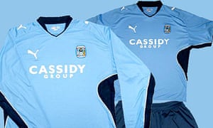
3. Coventry City home (2009)

Coventry-Joy-of-Six-001.jpg

Coventry 2009: Bland! Bland! Bland! Photograph: Public Domain
Coventry City have a terrible reputation for turning out in shocking clobber. This shirt, for example, is often cited as the worst ever, an affront to cotton. But why? It's not too flash; modern marketing types would probably point out how it'd go well with jeans, and that the vertical flash is very flattering for the larger gentleman (unlike, for example, the conceptual jape Kappa played on Robbie Keane a few years ago). It's because it's brown, isn't it? Well, so what?

It's not the only City kit to have been buried under a hail of brickbats. Their 1987-88 shirt was much derided at the time for unimaginatively aping the iconic Denmark strip of Mexico 86 a year after the event – Southampton and Aston Villa copped for this as well – but if you're going to plagiarise, you may as well rip off the best. The one before it – the Granada Bingo cup final effort – was pilloried for its badges-hastily-sewn-onto-cheap-tops-by-tea-lady-in-back-room scruffiness. As though that was a bad thing; the cheap park-football look is exactly the reason it looked money.

And even the T for Talbot one, while not exactly an aesthetic triumph, gets the thumbs up for working-class hero Jimmy Hill's sheer obstinacy. Hill boldly circumvented league advertising rules by working a huge sponsor's logo into the design of the kit, effectively dancing around in front of the Football League board, flicking the Vs. Right in the big fat confused face of The Man.

And now? Now the Coventry kit is very tasteful, very understated – and very boring. Which is a far bigger crime than anything that went before. And that even includes this.

Joy of Six: Worst Kits | Scott Murray
 

WillenhallSkyBlues

Well-Known Member
Oldham just released their Hummel kits today, wouldn’t be surprised if their something similar just sky blue and white

I’m looking forward to having a badge that isn’t just ironed though like just sport have done the last few years
 

Users who are viewing this thread

Top