Coronavirus Thread (Off Topic, Politics) (7 Viewers)

Sky_Blue_Dreamer

Well-Known Member
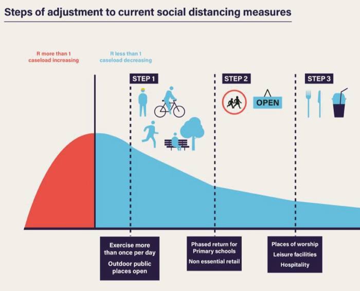
I think the y-axis is Covid caseload and the vertical line marks the case load that implies R=1

So basically all it's showing is when cases plateau, because each infection is resulting in 1 new infection. Would've been useful if they'd actually labelled the axes. And put a bit in the graphic showing what would happen if R goes above 1 and cases increase again so people are under no illusion this could come back and just because it's on a downward trend it'll remain that way. However, I suspect that's partly due to wanting it to look good for them and positive for the public but also due to them not wanting to show they'll put measures back in place even if it does so they could continue to have eased restrictions.
 

Brighton Sky Blue

Well-Known Member
So basically all it's showing is when cases plateau, because each infection is resulting in 1 new infection. Would've been useful if they'd actually labelled the axes. And put a bit in the graphic showing what would happen if R goes above 1 and cases increase again so people are under no illusion this could come back and just because it's on a downward trend it'll remain that way. However, I suspect that's partly due to wanting it to look good for them and positive for the public but also due to them not wanting to show they'll put measures back in place even if it does so they could continue to have eased restrictions.

The people who make these graphics do a bad enough job already without adding more complexity. The BBC ones are the worst
 

David O'Day

Well-Known Member
Why would the anti body test show the study to be so wrong? I think you're wrong on this one Dom. Even if the antibody test showed 10% of the population had been affected it would be a huge huge difference from modelling

Sent from my ELE-L29 using Tapatalk
I think he is not understanding how these studies work.

It may be he thinks they are like the positive tests where youbvoyld say with mild and asymptomatic cases you may have had 10x the cases?

Sent from my SM-G975F using Tapatalk
 

David O'Day

Well-Known Member
Anyone else getting pissed off with people asking about football??? I miss it as much as the next guy but FFS there is much more important issues going on at the moment!!!
Not really, other folk are having to go back work.


Sent from my SM-G975F using Tapatalk
 

Brighton Sky Blue

Well-Known Member
Anyone else getting pissed off with people asking about football??? I miss it as much as the next guy but FFS there is much more important issues going on at the moment!!!

I get that but denying anything enjoyable while working under stressful circumstances is a continued kick in the balls
 

shmmeee

Well-Known Member
I don't know if it's just me being really stupid but they keep putting up this lockdown easing graphic and it's really starting to bug me,

https%3A%2F%2Fd1e00ek4ebabms.cloudfront.net%2Fproduction%2Fe355f554-4dde-473d-b2d4-76426d2e0e31.jpg

Surely the horizontal axis is time and the vertical axis is R, so surely the line for R=1 should be horizontal, not vertical. It's bugged me since they first showed it but no-one else seems to have noticed or mentioned it, so it is just me being really dense and misunderstanding the graphic?

My only other thought is that the horizontal axis is R, but decreases from L-R rather than the usual increasing and the vertical axis is cases?

Y axis is cases/deaths I think. Once R is below 1 cases fall?
 

clint van damme

Well-Known Member
I think we are looking at antivirals as well, but the obvious answer is that some people have undiagnosed underlying illnesses and there’s been lots of reports of people suddenly deteriorating in a matter of hours after feeling OK, so you’d still get significant excess deaths even if hospital survival rates improved dramatically.

That's probably down to that 'happy hypoxia'.
Seems fairly unique to this virus and quite sinister as well!
 

shmmeee

Well-Known Member
So basically all it's showing is when cases plateau, because each infection is resulting in 1 new infection. Would've been useful if they'd actually labelled the axes. And put a bit in the graphic showing what would happen if R goes above 1 and cases increase again so people are under no illusion this could come back and just because it's on a downward trend it'll remain that way. However, I suspect that's partly due to wanting it to look good for them and positive for the public but also due to them not wanting to show they'll put measures back in place even if it does so they could continue to have eased restrictions.

Be fair, when Scotland did this (second wave) people on here were slating then for not having exact time periods between labelled.
 

Ian1779

Well-Known Member
I don't know if it's just me being really stupid but they keep putting up this lockdown easing graphic and it's really starting to bug me,

https%3A%2F%2Fd1e00ek4ebabms.cloudfront.net%2Fproduction%2Fe355f554-4dde-473d-b2d4-76426d2e0e31.jpg

Surely the horizontal axis is time and the vertical axis is R, so surely the line for R=1 should be horizontal, not vertical. It's bugged me since they first showed it but no-one else seems to have noticed or mentioned it, so it is just me being really dense and misunderstanding the graphic?

My only other thought is that the horizontal axis is R, but decreases from L-R rather than the usual increasing and the vertical axis is cases?

It bugged me because it’s mathematical nonsense, but also the shape of the graph suggests that the R value peaked at 1 - which again is total bollocks.
 

Rusty Trombone

Well-Known Member
I don't know if it's just me being really stupid but they keep putting up this lockdown easing graphic and it's really starting to bug me,

https%3A%2F%2Fd1e00ek4ebabms.cloudfront.net%2Fproduction%2Fe355f554-4dde-473d-b2d4-76426d2e0e31.jpg

Surely the horizontal axis is time and the vertical axis is R, so surely the line for R=1 should be horizontal, not vertical. It's bugged me since they first showed it but no-one else seems to have noticed or mentioned it, so it is just me being really dense and misunderstanding the graphic?

My only other thought is that the horizontal axis is R, but decreases from L-R rather than the usual increasing and the vertical axis is cases?

A teacher annotated Boris Johnson's confusing Covid-19 graphic and it's brilliant

upload_2020-5-21_19-28-18.png
 

wingy

Well-Known Member
It bugged me because it’s mathematical nonsense, but also the shape of the graph suggests that the R value peaked at 1 - which again is total bollocks.
Been as high as 4 according to Sturgeon .
That was at some point in March and she didn't say if that was UK or Scotland.
 

David O'Day

Well-Known Member
On the bbc website they are running a page that flashes up the name, photo and a description of an victim of covid-19 in the UK.

It states to view all victims it would take 88 hours. 88 fucking hours.

Sent from my SM-G975F using Tapatalk
 

Earlsdon_Skyblue1

Well-Known Member
With all the brains on this thread, it is quite a bit of a shame that there isn't more debate about the actual virus. There seems to be just a field of Tory bashing.

Something really isn't right about this whole thing.

Seems to have skipped most people that the Chinese state have effectively just got involved with the bailout of Norwegian Airlines.

This thing has been out and about for getting on for six months and the rest of the world still seems to know fuck all about it.

Something feels very very wrong and odd about this.
 

fernandopartridge

Well-Known Member
With all the brains on this thread, it is quite a bit of a shame that there isn't more debate about the actual virus. There seems to be just a field of Tory bashing.

Something really isn't right about this whole thing.

Seems to have skipped most people that the Chinese state have effectively just got involved with the bailout of Norwegian Airlines.

This thing has been out and about for getting on for six months and the rest of the world still seems to know fuck all about it.

Something feels very very wrong and odd about this.

Do you think this is the Chinese state trying to distress the world economy?

Sent from my ELE-L29 using Tapatalk
 

Users who are viewing this thread

Top