Nick
Administrator
Hmm would they make an announcement? I thought it might be something like that but it's usually sbitc and ccfc retweet3rd clue looks like walking football to me
Hmm would they make an announcement? I thought it might be something like that but it's usually sbitc and ccfc retweet3rd clue looks like walking football to me
Has what's his name actually ever announced signings before? He's more media and stuff. My guess is a friendly with Brum or something
That is one niche reaction GIF.
But I like it.


I couldn’t take it off he just wandered out wearing the new kit on Friday. Either way I hope it’s done soon.lad that works t city as part of the football operations put this, cryptic message(hoping) maybe
Sent from my SM-G960F using Tapatalk
Imagine that, with a Facebook/Instagram live stream too capturing the reactionI couldn’t take it off he just wandered out wearing the new kit on Friday. Either way I hope it’s done soon.
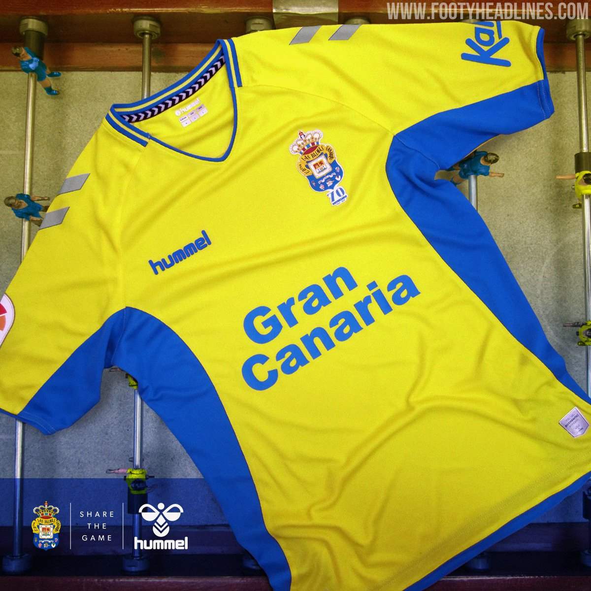
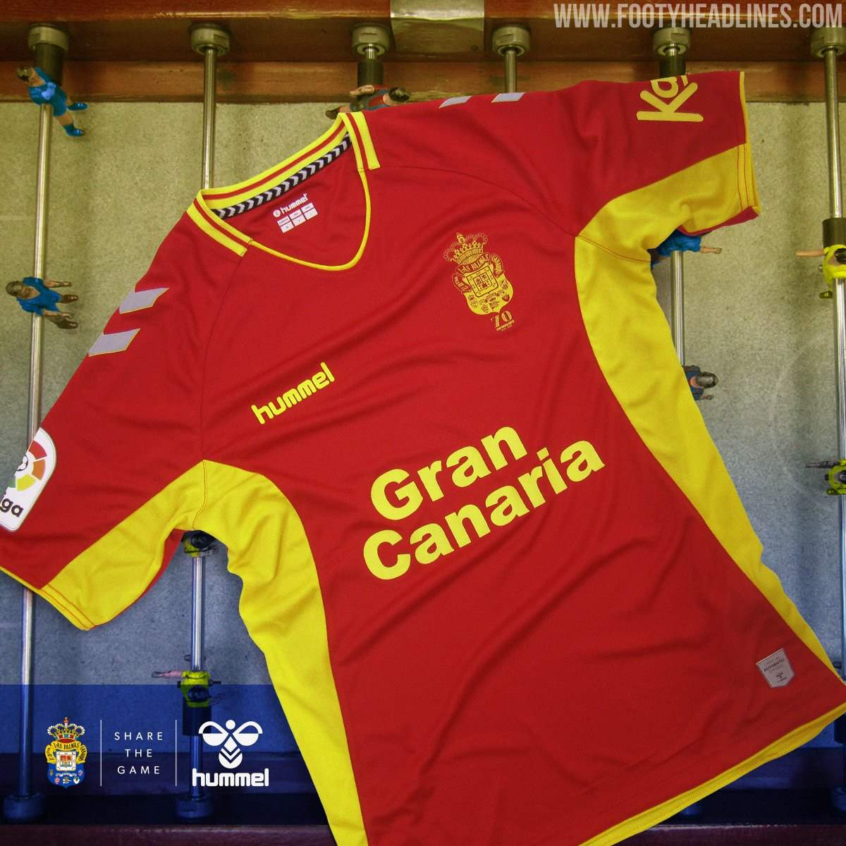
As part of our deal with them we get 5 years of bespoke kits.I don't know a lot about Hummel. Are they similar to other kit providers in that they work off templates that are used for a number of teams or is each kit unique?
E.g. last season our kit shared similarities to Portsmouth, Man City and probably a few others.


As part of our deal with them we get 5 years of bespoke kits.

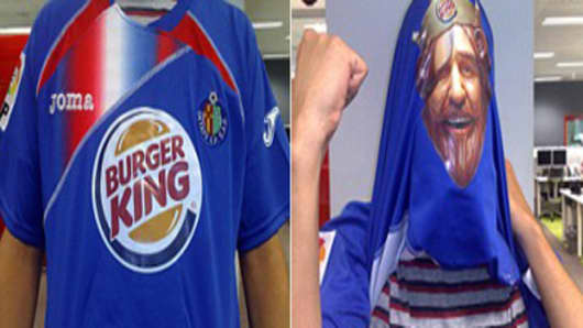
Poor old Stokes has got to wear that next seasonNo one can ever complain about what their club’s kit or sponsor looks like ever again!
View attachment 12527
No one can ever complain about what their club’s kit or sponsor looks like ever again!
View attachment 12527
Why does every new badge in the EFL look the same too. They're all red, round, clip art image and stupid font.
You would think they would lock it downFirst item now in the shop Coventry 19-20 Hummel Staff Training Jersey