oucho
Well-Known Member
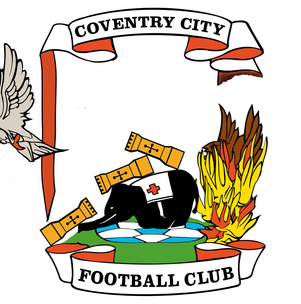
A couple of years ago I was preparing for my wedding, and lucky enough to be getting a tailored suit made. I had this crazy idea of the jacket lining be an authentic reproduction print of the 1987 FA Cup winning CCFC home kit, and I thought it’d be fun to have the club badge embroidered on the inside, maybe above the inside pocket. I’ve always been slightly dissatisfied with the club crest though, which I felt was overdue for a bit of a tidy up. Not a completely new take like the disastrous Mike McGinnity one from 2005, but an ‘evolution’ of the existing crest, with a more modern feel.
I decided to hire a graphic designer, and worked with him to create this new logo. It didn’t really work out though, and whilst what we came up with together (after many rounds of revisions and feedback) was clearly a cousin of the current logo, I wasn’t quite satisfied with the outcome, so I shelved the idea, and forgot all about the illustration files he’d come up with.
A year or so later I decided to have another play at creating something out of the previous design, and finally came up with something I liked. I’ve been sitting on the design for a while, uncertain exactly what to do with it. I thought maybe it was good enough to share with the club? But maybe that’s crazy talk. What would other actual fans think of it?
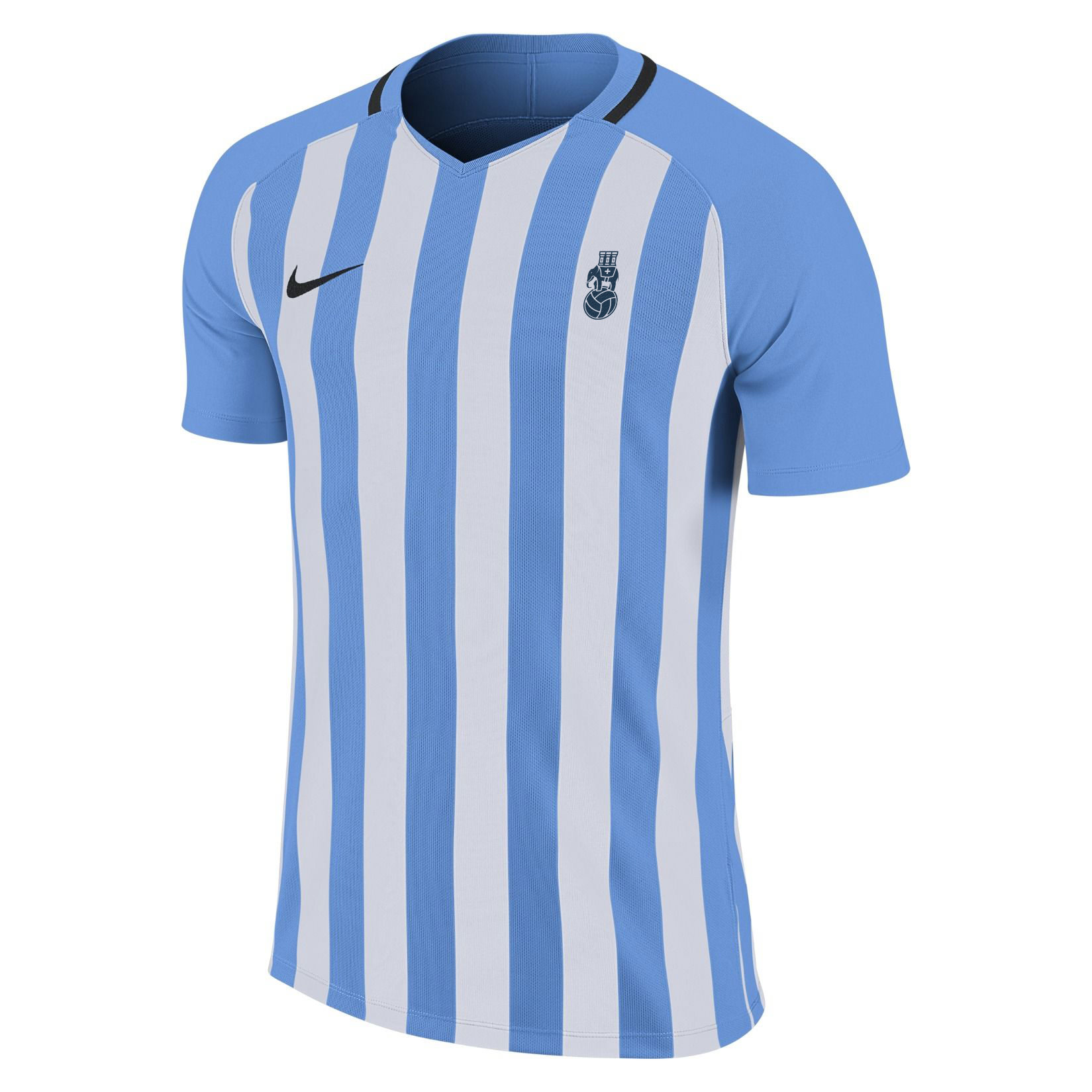
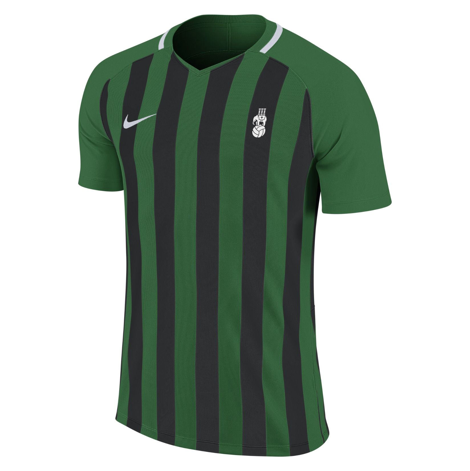
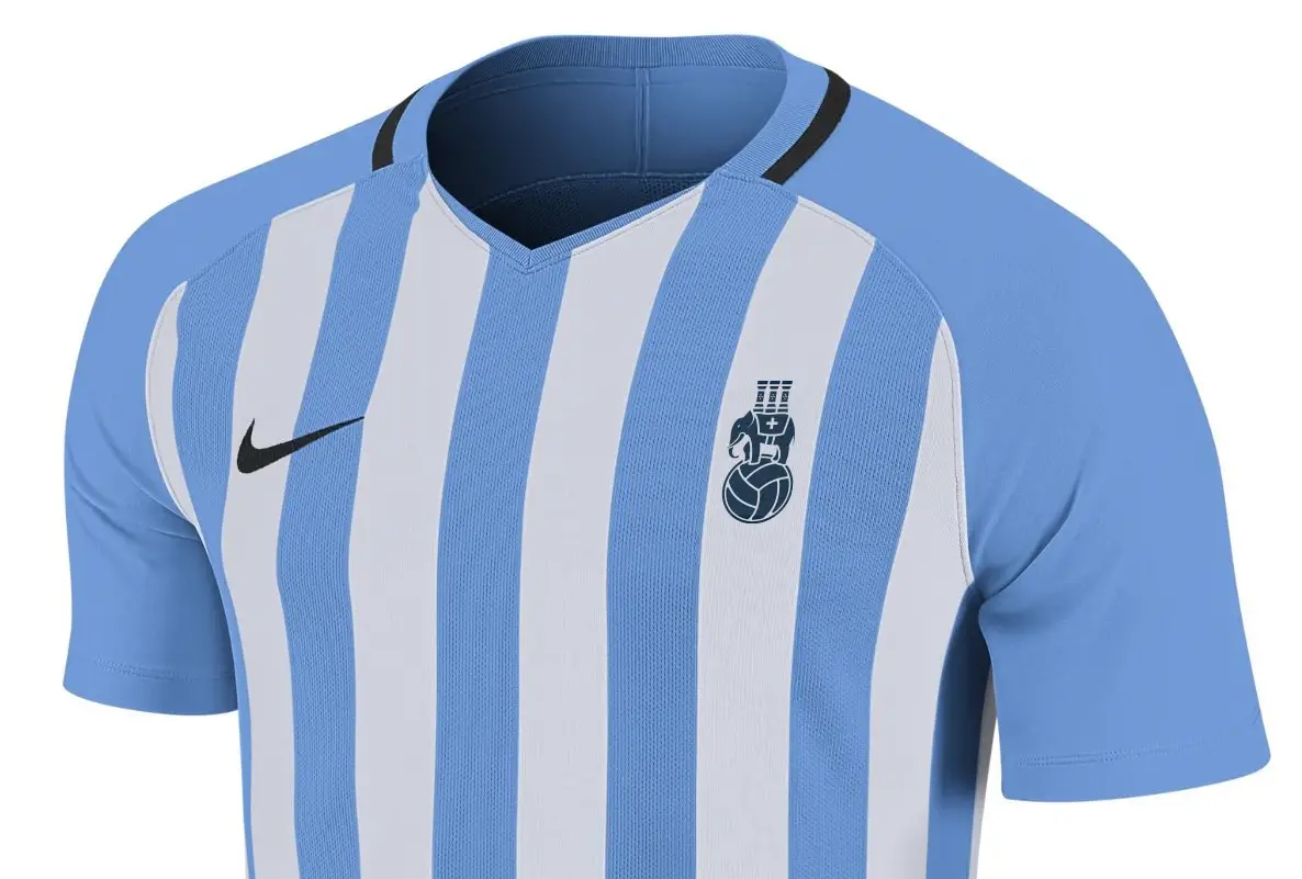
A few months back I saw a preview of Nike’s Teamwear range for 2018/19, which includes a sky blue and white striped shirt that I can easily see us using as our kit next season, so I stuck the badge on it. I ended up tweeting this mockup on Friday night as part of a conversation about our Puma shirt history, and then popped the new badge on Twitter itself for good measure.
So I thought, why not share it with a bunch of Sky Blues fans, and get some feedback?
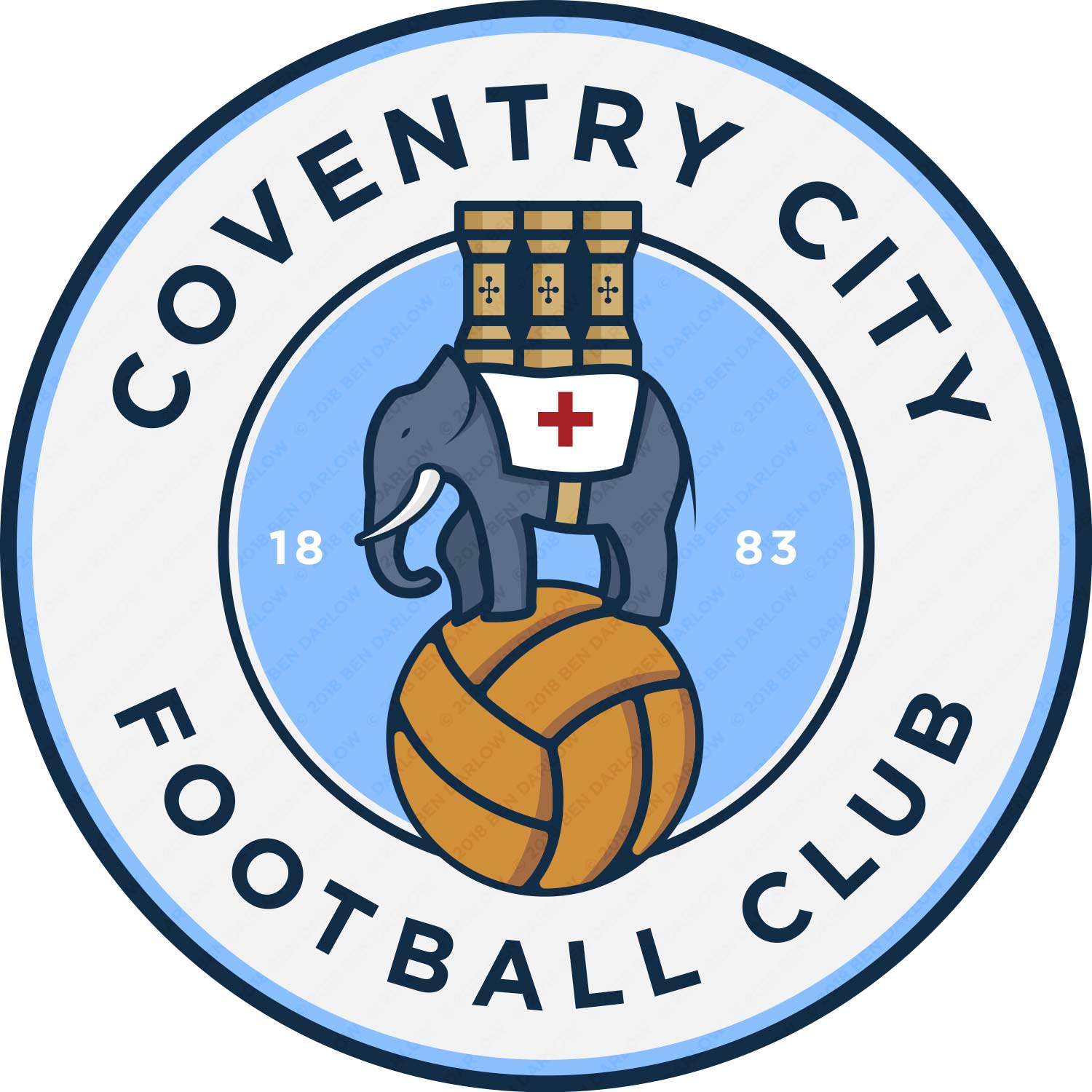
Anyway, let me know what you think?
Like others have posted I quite like our badge and hope we keep it; I did like the 125-year anniversary badge we played on, but also glad it was only 1 season. I think we have one of the best club crests in the league.
But that said, despite the similarity with the Man City badge which is then first thing to jump out at you, your design looks pretty good and I'd certainly not be disappointed if we adopted it for a couple of years. You've done a nice bit of work there.